To know your way around this game, you must first of all get accustomed to these two “views”, the internal “Kingdom View” and the external “Field View”.
The Kingdom View is where you will manage all of the important structures of your kingdom. It is here that you can build and upgrade structures using the resources that you’ve gathered or produced.
Some of these structures are unique and cannot be shifted or demolished, like the “Academy”, “Castle”, “Treasure House”, “Hospital”, “Hall of Alliance”, “Storage”, “Trading Post”, “Wall” and “Watch Tower”. Others can be freely built in numbers and/or taken down for the slightest of reasons (for instance, you dislike their present position or no longer require that many of them), like the “Barrack”, “Farm”, “Lumber Camp”, “Quarry” and “Gold Mine”.
The Field View, as its name suggests, is where you will interact with all the stuff that lies outside of your kingdom. It is here that you will find monsters to hunt, resources to gather and player kingdoms (whether active or abandoned) that you can attack and pillage.
Although both of these views, on first look, are pretty similar to one another, there are still some subtle differences if you take the time to observe closer. But anyway, starting from the common, we have something like your profile in the top left and an info bar showing resource stuff in the top right.
For this profile section, there are two clickable parts. Clicking the larger portion on the left brings up certain information about your kingdom, like name, profile picture, troop strength and type, mastery learnt, treasures equipped, etc. Some of these information are privy to you and you alone, while some are open for all to see (but can be slightly redacted). Other stuff that are accessible from here include the “blockchain” layer of this game, your account information as well as game settings.
Clicking the smaller portion on the right will show you your account’s VIP level. Here, you can collect your daily bonus rewards for logging in. You can also see what sort of status boosts that is enabled for your present VIP level. As you work on increasing this VIP level, the bonus rewards that you collect as well as the status boosts that is applied will improve accordingly. You can use the arrows on either side to scroll through the various VIP levels to preview what is being offered.
And although it is named as such, this VIP level isn’t something that is implemented for paying customers. It can be leveled up by consuming VIP point tokens that you can get by doing stuff in-game that either rewards you with or allows you to purchase these tokens. Alternatively, you can also get a tiny amount of these points by simply logging in every single day.
Apart from these, you will do well to take note of the green and red arrow icons found right beside this profile section. The green arrow represents “buffs” that is currently affecting your kingdom and troops, while the red arrow represents “debuffs”. You can click on the arrows for more details pertaining to what sort of buffs and debuffs they are as well as their duration. If there isn’t any affecting your kingdom at the moment, then these icons will not appear.
I suppose there shouldn’t be a need to explain about the in-game clock that also happens to be located in this area of the game interface right? It is primarily used by players to keep track of timed events and quests, so that they will know when it starts and ends with respect to their own local time.
In the top right corner is your resource bar. From what I can see here, there appears to be five kinds of resources in this game, “Food”, “Lumber”, “Stone”, “Gold” and “Crystals”. The first four seems to be your regular “in-game” resources, while the final one looks like your typical “cash shop money” that can be seen in so many online MMO games.
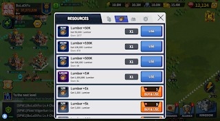
If you try clicking this resource bar, on any of the four “in-game” resource, you will bring up a window that allows you to use existing “resource tokens” (that you have in your “Inventory Bag”) to increase the corresponding resource’s amount by the value indicated on the token you have used. Should you not have any of these said tokens, you can also opt to pay for them using “Crystals” instead.
Clicking on the crystal part of this resource bar will bring you to the “cash shop” of this game. Here, you will be able to spend real life money to get yourself more crystals. You will also find all sorts of “super-value” packages as well as limited time offers that are made to entice you into buying to speed up your kingdom’s advancement and progress.
And while we’re on the topic of “Crystals”, one cool aspect is that although it is deemed as a “cash shop” resource, you can still appear to get it from doing quests in-game or even find crystal mines to harvest if you look around the field map for it.
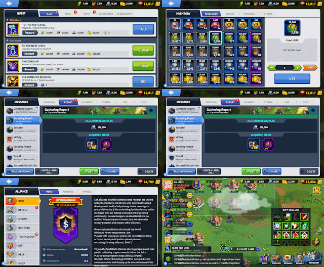
Down at the bottom left is your chat window (refer “Kingdom or Field View” pic). Clicking on the smaller box with a light green icon (on the left) will allow you to switch between “World” and “Alliance” chat, while clicking on the larger rectangle with the text (on the right) will bring up the enlarged version of this chat window (which has more functions available).
My personal evaluation of this game’s chat window is that, it is clunky to use at best and leaves much to be desired. The reason for this is that, being a warring game, there will be fights breaking out between alliances and this means coordination between quite a number (if not a lot) of people becomes necessary. And when we talk about coordination, what better way than to use the game’s very own chat function, right? Wrong, because that’s where the problem starts.
First of all, the space in the chat window is only enough for three lines of text. With no means of scrolling through it, imagine if there is a lot of activity happening and chat messages are flying all around. Yup, you will end up slow in reacting to important instructions or worst still, missing them altogether.
Secondly, there is no way to type into this chat without bringing up the enlarged version of it. But when you do, it blocks out the game’s entire screen and you will not be able to see or do anything else until you close this bulky chat window first.
So now the question becomes, do you prioritize on giving out instructions and reports on enemy attacks first or do you do something about it first, and then report? What if an impending attack comes your way during the time your chat window is enlarged? Would you be able to react to it in time?
The third problem that I have with this chat window is that while you are scrolling through previous chat messages, if someone types something new into the chat, you will lose your present focus and the chat jumps to some other line. This results in you losing track of what you were just reading and have to scroll up or down to try and find that specific line that you were just reading a while ago. Now imagine if two or more people are having a conversation during this time. Welcome to hell.
Despite all these negatives, there are still some features that I do like about it. For example, the ability to share in-game coordinates and reports of kingdoms, resources, mobs, scouts and attacks. Clicking on them will bring you to the exact location or show you details of the reports in question.
Another thing that I like is that you can translate messages that other people have typed in chat, that’s in another language, into one that you recognize and is somewhat readable to you. This allows you to be able to converse with someone from another country despite not having a common language.
Lastly, at the bottom right, you will have what appears to be the “Quest”, “Inventory”, “Messages”, “Alliance” and “Field/Kingdom” icons.
- Quest
This is where you go to in order to keep track (or claim the rewards) of all your currently active/completed quests. Typical quest format includes “Main” and “Side” quests that are always active until completed, “Daily” quests that will refresh itself once per day (at 00:00 UTC), “Event” quests that can be timed and may stretch over the course of a few days and “Battlefield” quests that are active only during the “Continent vs Continent” event where kingdoms need to teleport into a special field and fight together as one, against kingdoms of other continents. - Inventory
As its name suggests, this is the place which houses all of the useful items that you’ve looted off mobs or gotten rewarded with from quests. They are generally categorized into “Resources” (the previously mentioned resource tokens will be under here), “Boosts” (buff items that affects your kingdom when used), “Speedups” (things that you can use to reduce the time needed for something to complete) and “Others” (stuff that can’t be classified under the previous three). - Messages
This is like your personal “mail box”. You can use it to send and receive in-game private messages, get reports of attacks, scouts, resource gatherings and monster kills, as well as system-sent messages and rewards. - Alliance
All functions associated with banding together a group of disparate kingdoms can be found here. You can use this to create or look for alliances to join if you haven’t yet gotten into one or leave if you are already in one. Other alliance-related stuff like managing your members if you are the leader (R5) or management tier (R4), donating resources to research alliance tech and helping alliance members to speed up their building upgrades/research projects can also be performed here. There is also an alliance shop where you can buy useful items from, with the points that you’ve gained from donating resources and helping fellow members, right here as well. - Field / Kingdom
You basically just use this to switch between your Kingdom View and Field View.
For the differences, the very first distinction would be what’s noticeably on the middle left of both the Kingdom View and the Field View. On the Kingdom View, you will have 4 circular icons or “slots” as I would rather call them.
The first two on the top represents your “construction slots”. You will need one of these freed whenever you wish to start off with building a new structure or when upgrading an existing one. The first slot is given to you right at the start of the game while the second one will only be unlocked temporarily via the use of a golden hammer or permanently once you’ve reached “VIP Level 5”.
The third slot is your “troop training slot”. You will need this slot to start churning out troops from your barracks. Wait I know what you’re thinking, but no, it is not possible for you to increase the number of these slots by building more barracks. This is your one and only one for troops training.
The final fourth slot is your “research slot”. Tech projects that you start in your Academy will use up this slot. And as you’ve guessed, since there is only one of these, you can only research these projects one at a time.
On the Field View, what you have instead is a bunch of “troop dispatch queues”. Whenever you instruct your troops to do a particular task, such as to go out on a resource gathering trip, to hunt a monster, to join in a rally or to scout and get information on some target, you will take up one of these “queues”.
Initially, you will start out with only 2 of these dispatch queues. However, by upgrading your castle level (+3), researching it (+1), increasing your VIP level (+1) and learning it in combat mastery (+1), you can slowly unlock more and make your way up to the present maximum of 8.
Other than that, the only important ones left would be your “Resource Finder”, your “Home” button, an info bar showing in-game coordinates of your present focus and the “LoK Land Directory” button...all of which can only be seen in the Field View and not the Kingdom View. (Yes, I know they sound corny, but I don’t know how else to call them.)
- Resource Finder
Clicking on this will bring out a row of 5 icons and each of these allows you to cycle through specific targets that are near your kingdom, namely Food, Lumber, Stone, Gold and Others. - Home
The function of this is two-fold. As you scroll around the field, this will act as an indicator showing you the general direction and distance of your kingdom from where you are focused now. And clicking on it will instantly bring the focus back to your kingdom. - Info Bar
There’s quite a bit of utility to be found here. First, the letters and numbers quite visibly shown represent the location of your present focus. “C” reflects the “Continent”, while “X” and “Y” are your “X-coordinate” and “Y-coordinate”. If you click on it and then key in a new set of “X” and “Y” numbers, you can immediately put your focus onto the new location. This is rather useful for when you know where something is, but it is too far for you to scroll there manually with your mouse and there is no shortcut link for you to go there in one click.
Then on the left and right end of this, you have your “Bookmarks” and “World Map”. The “Bookmarks” allow you to keep a set of locations saved so that you can revisit them later on. These can be anything from resources to monsters to even enemy kingdoms. But as some of these mentioned can be dynamic, there is no guarantee that they will still be there for you when you return.
You can “bookmark” the target by clicking on it and then look for its “star” icon that’s usually found right under its name tag. A hollowed star means that the target isn’t bookmarked yet while a filled star means that you already have it in your bookmarks.
The “World Map” gives you the entire view of the continent. Without making use of any of the filters (found on the middle right), you can find that there is hardly much to look at on this map. Well quite frankly, even if you do, there still won’t be much though in my opinion.
Anyway, the various filters for you to fool around with are “Shrine”, “Object”, “Land” and “Level”. Turning off “Object” would make the whole map empty and disorient you, so you should not turn that off, which leaves us with only the other three I guess.
With “Shrine” on, you will be able to see all the different shrines (A, B, C and Congress) positioned around the map. These shrines are open for capture during “Shrine Event” and provide various bonuses when it is taken by your alliance and your kingdom is positioned within its buff zone.
The “Land” filter splits everything into small square boxes called “LoK Land” (with a unique number attached to it). Each of these lands is represented by a special NFT (non-fungible token) that exists on the Ethereum blockchain. At opportune times, the game developers may put up some of these for sale, after which their owners may then trade them privately between each other or openly on auction markets such as Opensea.
“Level” puts everything into a hue from brown to shades of green. This gives you information about the general level of the area in question. Starting from Level 1 to Level 10, the higher this level is, the higher the level of monsters and resources that will spawn in the area.
Then finally, at the bottom right corner below the filters, there is a “Continent” button. You can use this to take a tour of the other continents that is available in the game. Continent 1 is the “oldest”, with players mostly at the “high end” in terms of troops, tech and structure levels, while it gets progressively “younger” and less “mature” towards the continents with higher numbers (2, 3, 4, 5, etc).
As there is a system for you to migrate your kingdom onto another continent should you desire to do so, it would be wise for you to just take this as a general guideline. However, you will need to "jump through some hoops" (fulfill a few criteria) and pay an appropriate amount of crystals before you can do so. - LoK Land Directory
This is just an extension of the “Land” filter found in the “World Map” as mentioned previously. Its purpose, I guess, is to give you a sense of how large one piece of “LoK Land” is, the rough number of monsters and resources that can fit within its borders and the scale of it relative to an entire continent. You can use the arrows to scroll through neighboring blocks of land, one by one.


 Friday, April 23, 2021
11:37 PM
 BuLaDiFu






 Posted in: